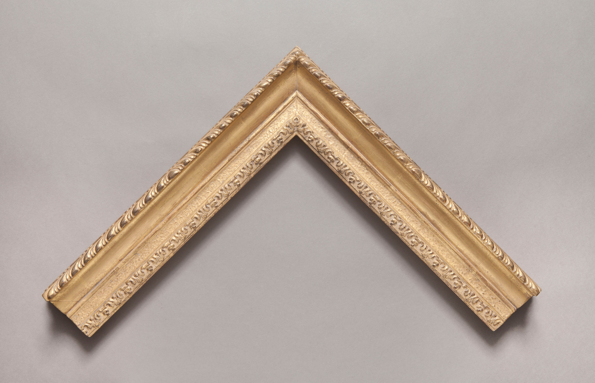
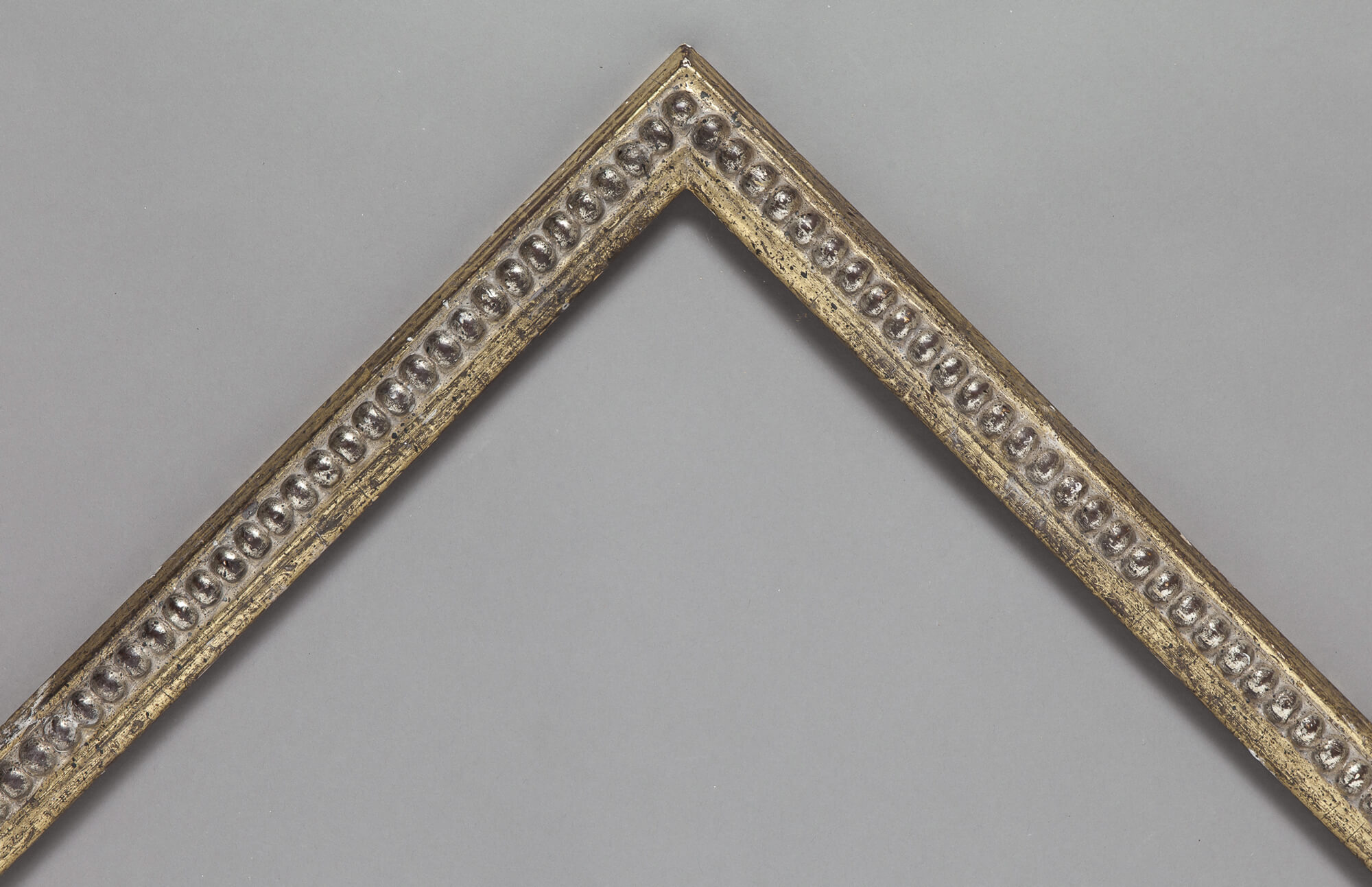
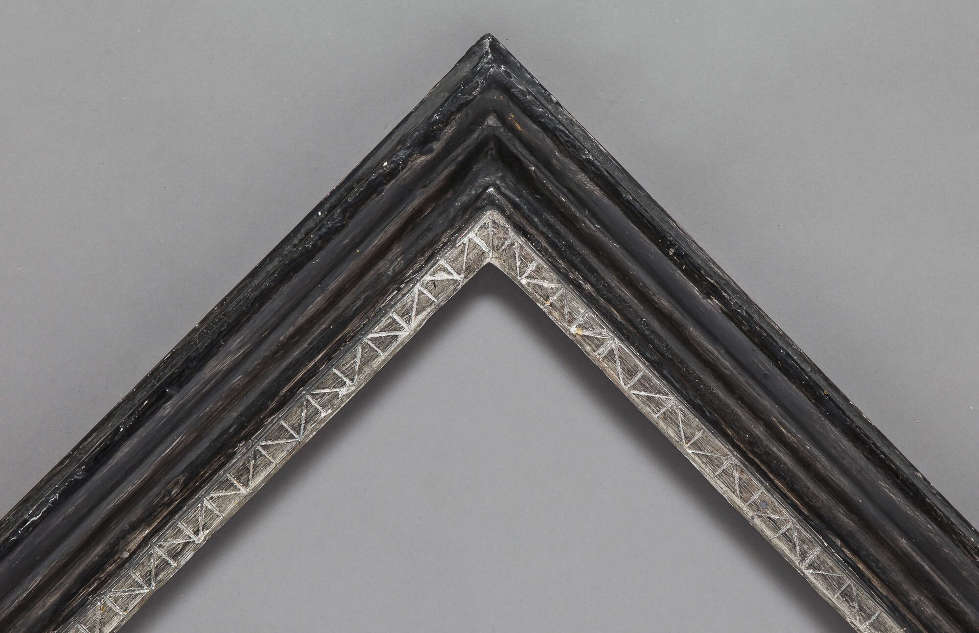
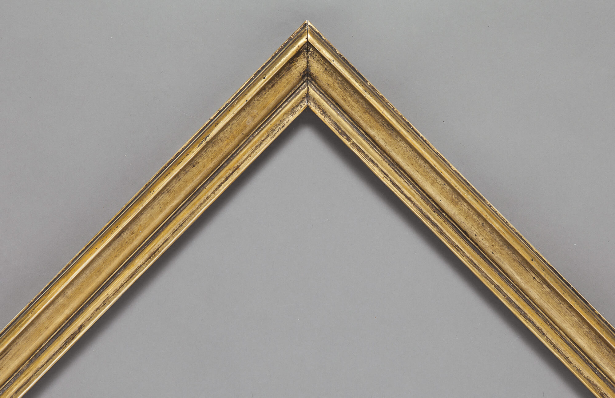
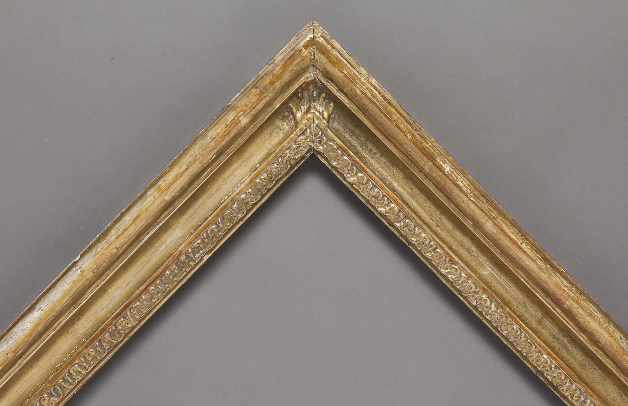
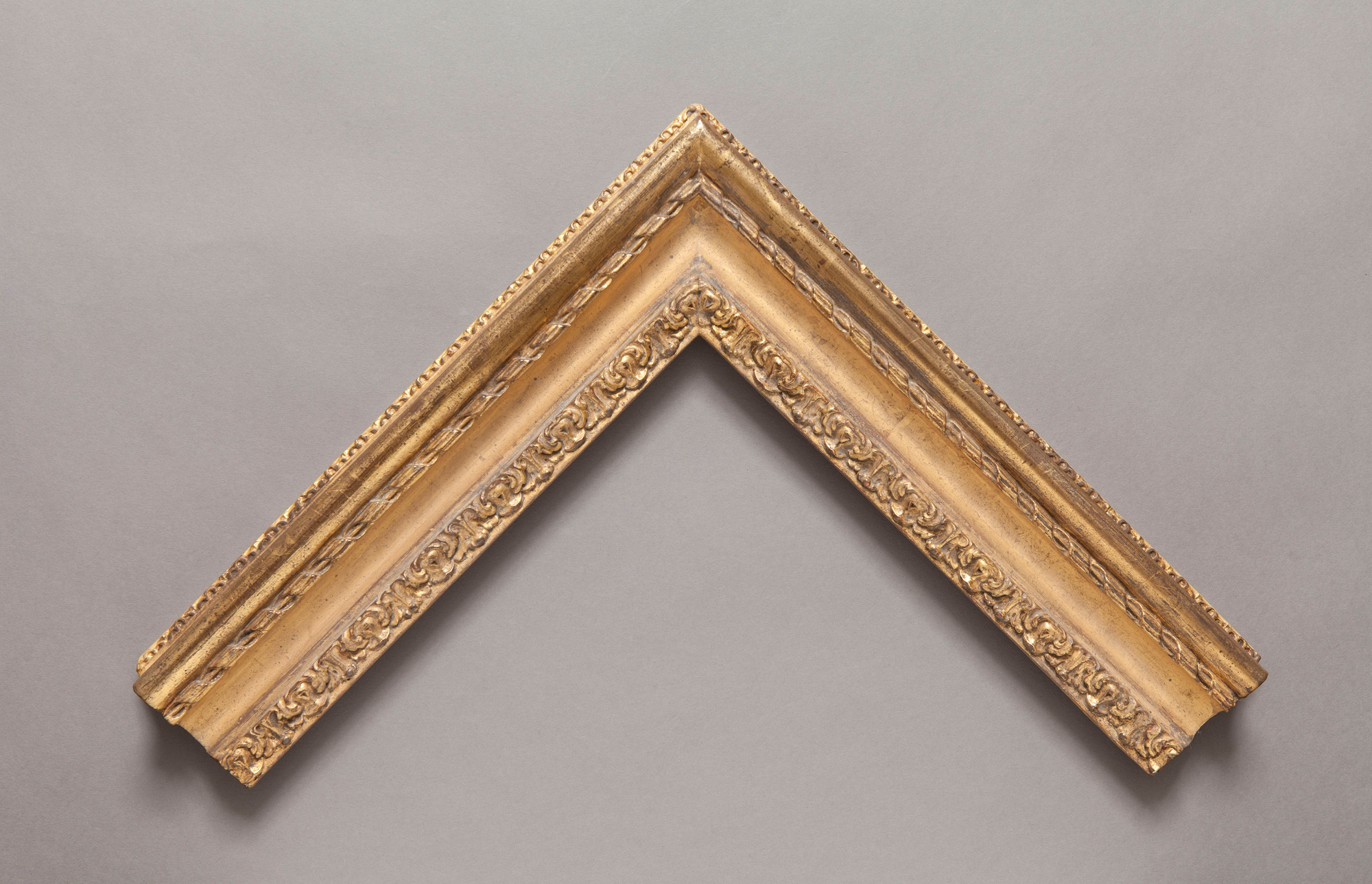
The English love to have their portraits painted, more so than any other culture; no other nation has the equivalent of the National Portrait Gallery and none is quite so interested with its own image across the generations. For centuries, this genteel self-obsession attracted work for the best painters in Europe, who brought their framing ideas with them as well as their palettes. So there are very few styles which can be described as thoroughly English until the Pre-Raphaelites, except the Morland (often carved with a scalloped detail on the sight edge described as “lamb’s tongue”), and the William Kent, named for the architect who introduced Palladianism to the English country house but who started life as a sign painter.
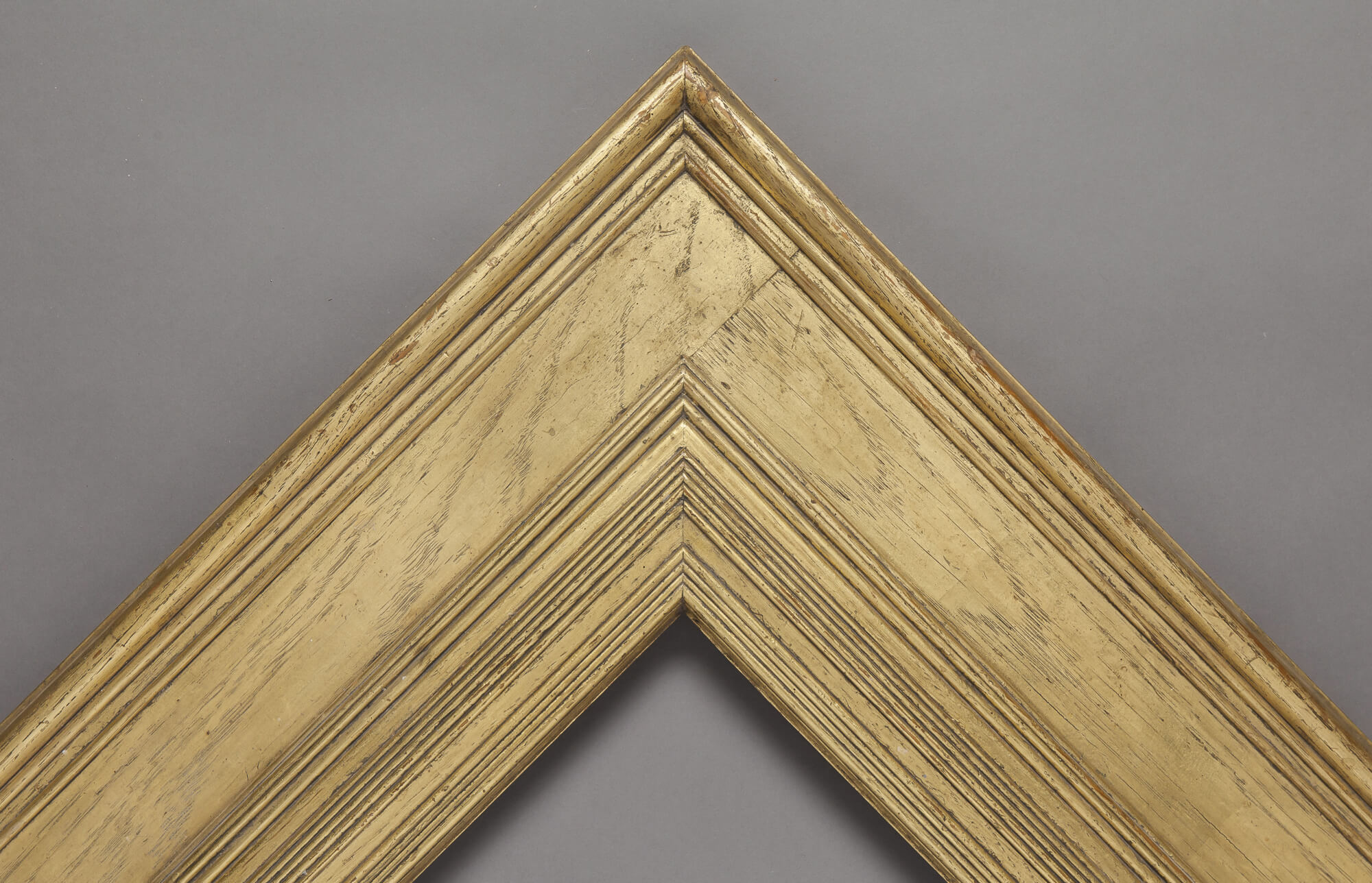
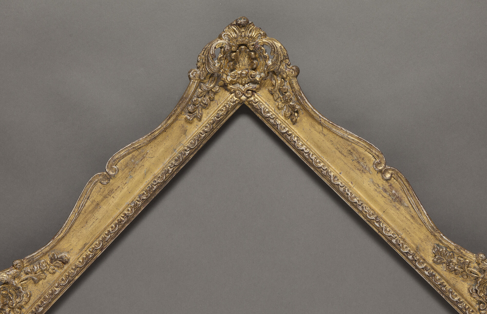
The most widely used Pre-Raphaelite frame is the Whistler, elegant and rectilinear, with more restraint that you might expect from such a dandy. Dante Gabriel Rossetti and Watts both designed exquisite profiles for their allegorical canvases. Later, English adaptations of notably Dutch and rococo frames gained currency.
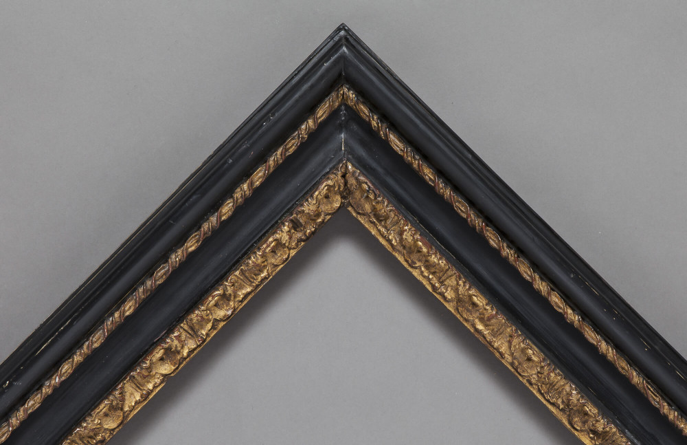
Subtleties differentiate an English frame from its French counterpart. The boles, or clays, used under the gilding are paler; muddier reds or soft pinks, even a greyish blue instead of the deep vermilion of the French. As a result, the gold is knocked back, looks less rich. But we still take the same care throughout, using original moulds to recreate ornamentation, re-carving the gesso to achieve a perfect crispness. For Pre-Raphaelite frames, traditionally made in oak and oil gilded directly onto the wood, Bourlet has developed a technique of water gilding which we feel creates more of a gentle glow and resonance than oil gilding which can lack life.
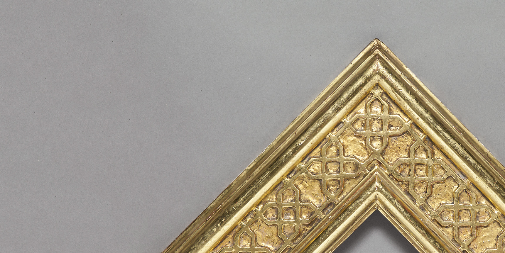
Islamic
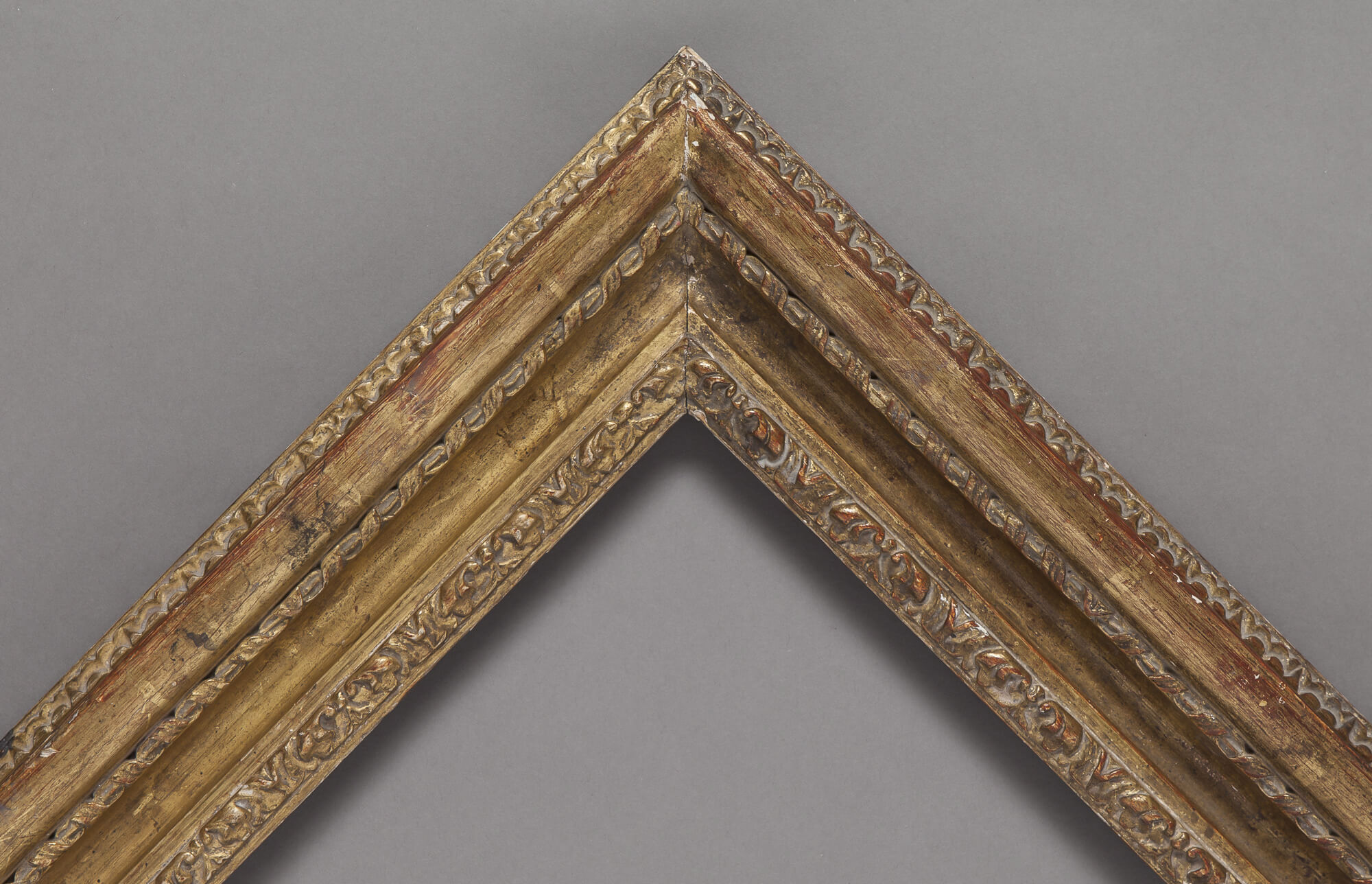
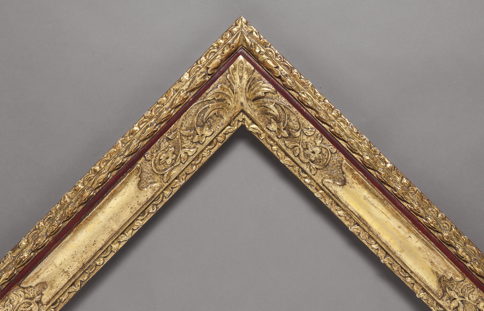
To achieve a jewel-like intensity, at Bourlet we gild each frame not just once but twice, adding a lavish second layer of gold leaf to increase depth.
 Download profile
 Download profile
 Download profile
 Download profile
 Download profile
 Download profile
 Download profile
 Download profile
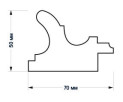 Download profile
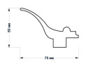 Download profile
 Download profile
 Download profile