Before & After
We love creating the first frame for a fresh, new work of art, often in collaboration with the artists themselves. But slightly more than half our efforts go into fine art reframing, a process of transformation with its own challenges and delights.
Taste and fashion moves on. Ownership changes and pictures find new contexts in different hands and interiors.
A new owner may have a passion for historical accuracy or a strong personal conviction as to how their own art is protected and presented. Or even just an urge to reward the work, and themselves, with a closer look at what really works, at how this particular picture can be made more glorious with something more thoughtful and appropriate.
Surprisingly, we do see a regular stream of interesting, often valuable oils in mass-produced mouldings – cheaply made frames which don’t really stand up to the scrutiny you want to give the image itself. We are even asked by major auction houses to remedy this for occasional works on their way to rather than from the saleroom, a last-minute investment in presenting a painting at its most powerful.
The best “before and afters” come from a joint process of consideration and experimentation with an owner, playing with possibilities, testing out ideas and intuition, colours and finishes. Taking time to get it right.
Sometimes the change is really quite dramatic. It’s always fascinating, at least to us. So we thought we would share some of our transformations with you, just to illustrate what a difference a frame makes.
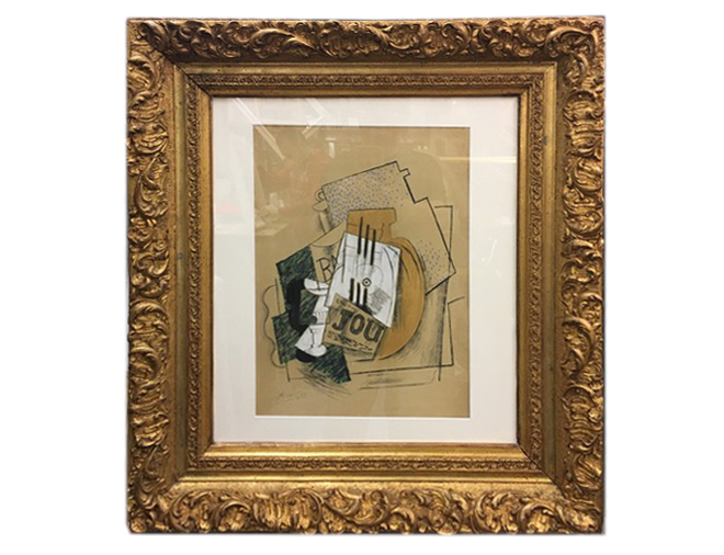
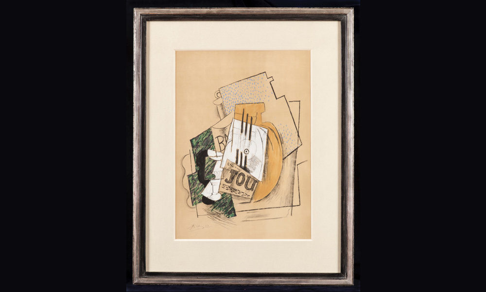
Lithograph by Picasso
Before
Celebrated author and journalist Lucia van der Post brought us this Picasso lithograph, a recent acquisition. At some point in its history, someone must have recycled a frame for it. Crudely gilded, the elaborate 19th century form rather overwhelmed, lacking the sophistication of the image. Distractingly, the mount was uneven on all sides, a tell-tale sign of a forced marriage. A work of great personality, in a borrowed suit…
After
In consultation with Lucia, we decided first on a mount of double thickness, washed with watercolour to create the softest tone (we usually find most “off the peg” mounts are too strident). The black lines within the composition called for some black in the frame as an anchor, but a solid black might have lacked subtlety. Instead, we divided the profile into two “steps”, a smart grey-black on the inside with white gold over a white bole for the outer border. Museum glass to follow, to minimise reflection.
Quietly elegant.
And all the more impactful for being so.
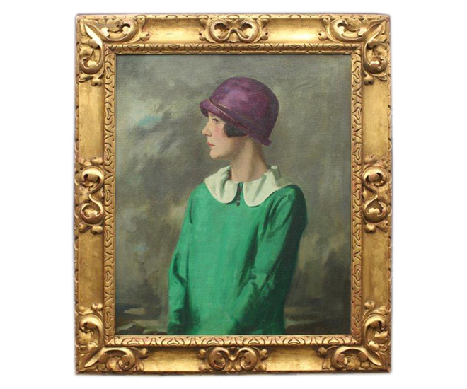
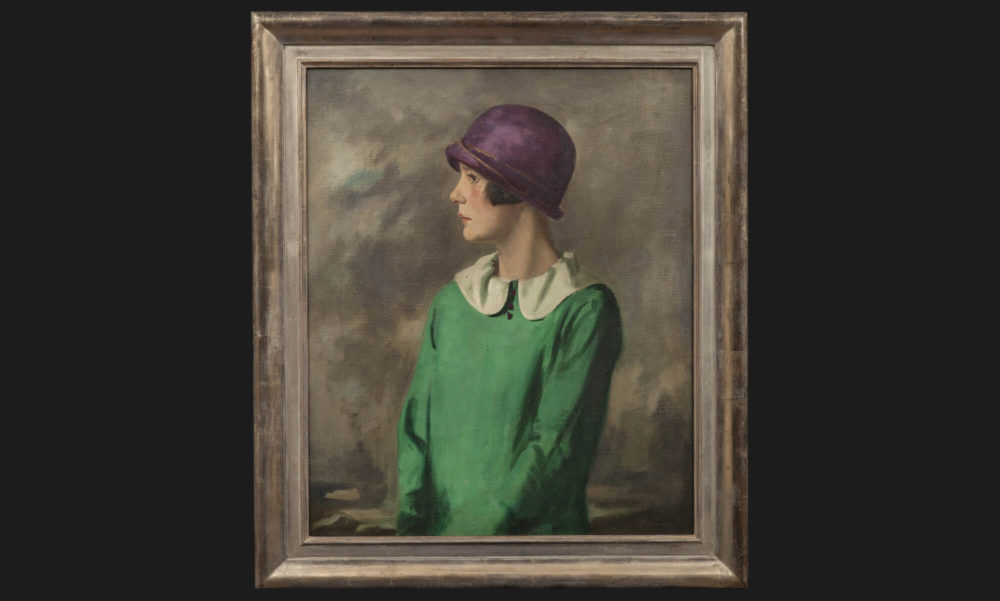
Portrait of a Lady in a Hat
Before
This oil of a rather smart young woman had what must have been in its time, a very expensive frame, 4.5 inches wide with elaborate corners and centres.
After
Its owner wanted a much more elegant, modern feel, but the image would look stranded in anything too streamlined. So the new frame is still 4.5 inches wide, but it’s lost its decorative flourishes. White gold replaces yellow creating a softer, more feminine glow; the inside edges of the moulding have been burnished for a subtle gleam and discrete craquelure adds texture. We love the tranquility of the end result, an echo of 1930’s post-Deco chic.
Self-Portrait by Sickert
Before
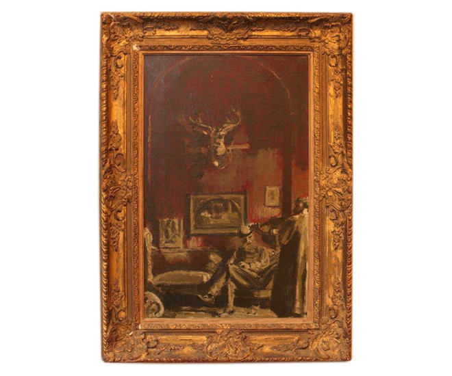
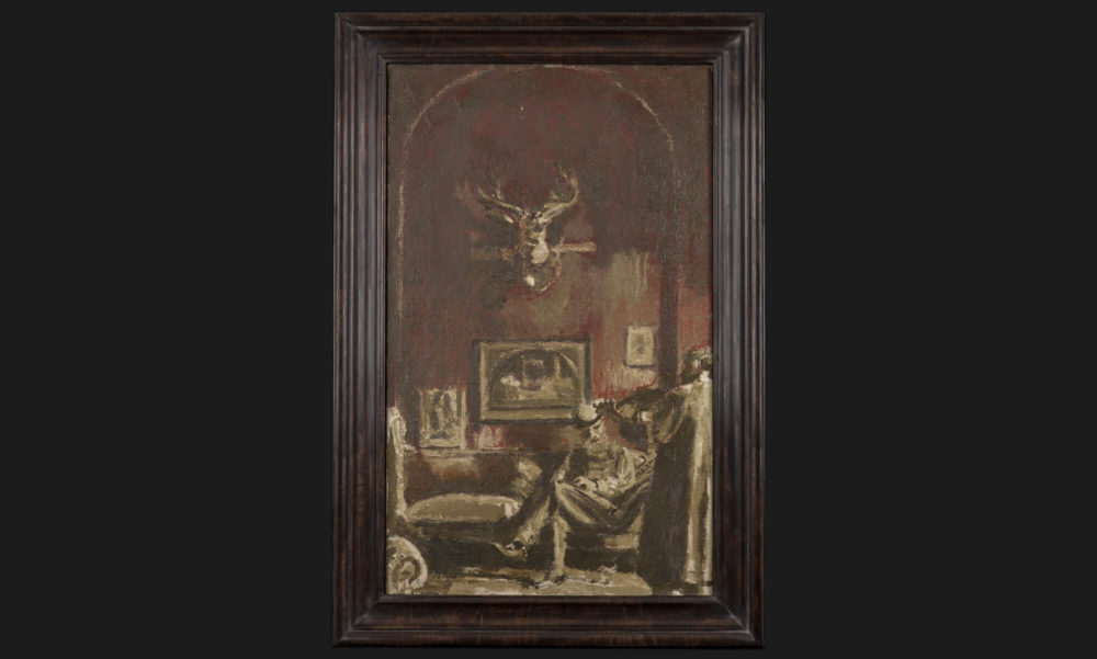
This important self-portrait by Sickert arrived with a weighty frame, using a heavy Louis XV gilded moulding with an added slip for even more heft.
After
Together with its new owner, a passionate and confident collector of Whistler’s work, we decided upon a French-polished frame of around 2.5 inches in width which is nearly, but not quite black. This frame has impact and interest but allows you far more effectively to enter the atmospheric interior scene with its almost religious contemplative gloom.
Euston Station by Sickert
Before
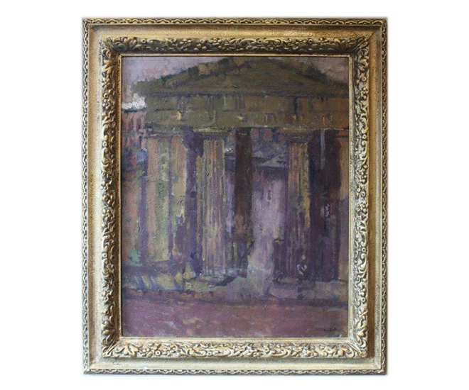
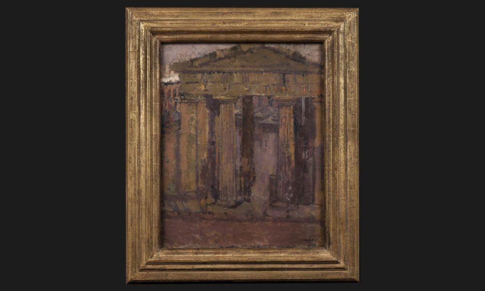
Another Sickert. This time with a frame that tried hard to look expensive with its decorations. But these had been finished using bronze powders rather than gold leaf, and failed to convince. The design of the frame itself, with its prominent border, somehow made the image seem pinched.
After
Our approach here was to go for plain. And architectural. The new frame was gilded by hand and then heavily distressed so that the gold does not disrupt the sombre tones of the piece.
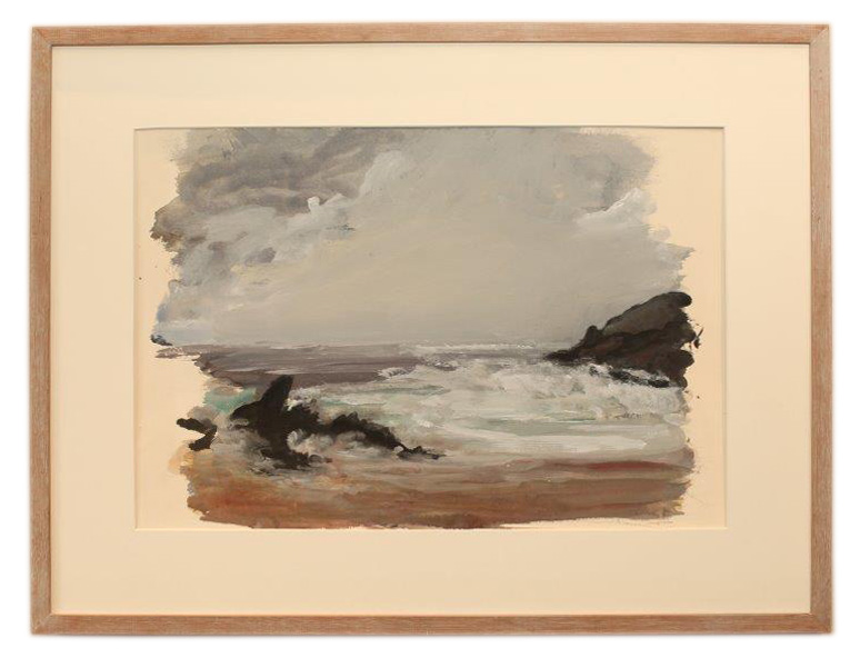
Seascape
Before
This watercolour of a semi-abstract seascape was simply, almost academically framed. Almost too simply – an off the shelf oak moulding and standard card mount looked a little dull and flat.
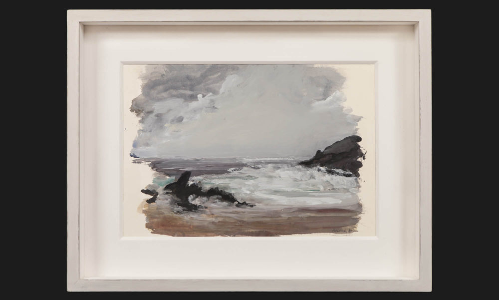
After
From our Bourlet Basics range, we selected a classic box frame, still hand-painted to create a feeling of fineness. Note the deeper cut mount which feels lavish and adds to the overall impression of quality.
A transformation on a budget perhaps, carried out with care.
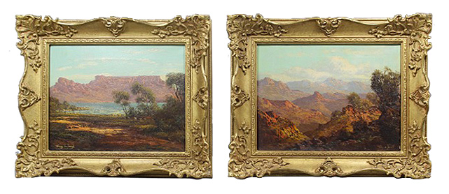
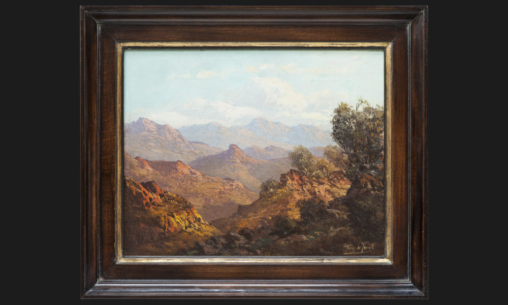
Two landscapes of South Africa by Tinus de Jongh
Before
A pair of earlier 20th century paintings, landscapes of South Africa, needed a rethink. Our client felt that the traditional rococo frames they arrived in from auction looked overly fussy and florid for his home, and the library wall they were destined for.
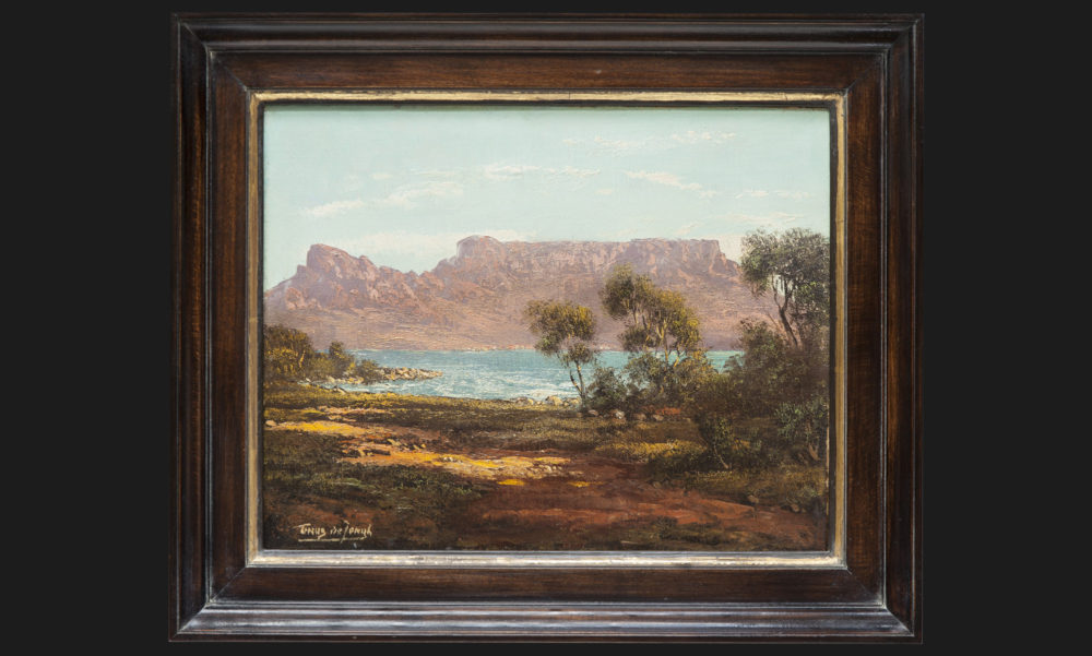
After
After trying countless samples out in the studio, we took half a step backwards and decided to start completely from scratch, sketching and then creating an entirely new profile; a crisp, Dutch-style cassetta with a modern elegance. Original metal cutters were made, allowing us to run off the necessary lengths of this new form in English beech, a hard wood without knots which still reveals interesting details. When constructed, the frames were french-polished to give a dark, lustrous gleam, stopping short of shiny. Finally, a faint amount of gold, applied by hand, defined the inside edges, subtly reflecting the sunlight in the oils themselves.
Two pictures transformed by simplicity, rescued from the sense of genre. Before, the dominance of the gilding almost competed with the works. Now the deep, masculine richness of our frames allows these little paintings to shine.
If you have a picture aching for its own transformation, why not bring it in to our atelier in Connaught Street and let’s play with the possibilities?
In our client's words
‘Bourlet did a wonderful job reframing a pair of South African oils. I was rather dubious about them as genre paintings bought at an auction sight unseen; now I can take real pride in them, as they line up with all my other paintings which have received a Bourlet make-over. The frames are perfect.’